There’s only a couple more months until the end of the 2023-24 NFL season, which means our favorite teams are clawing their way at the chance to get to the Super Bowl, or at least hoping to boost their current ranking just by a little bit. So of course, this is the perfect time to rank each team by their NFL team logo.
This entire process is based on personal preference, but there are some rankings that many others would agree on. From the simplistic logo with the Colts to the more detailed logo with the Dolphins, this is the complete ranking of the NFL team logos.
RELATED: Highest-Scoring Super Bowls in History
32. Washington Commanders
Sitting at the 32nd position of every NFL team logo is the Washington Commanders as the worst logo. Not only is this my least favorite, but it seems to rank low for several other tiers on the internet. The Washington Commanders were once known as the Washington Redskins from 1937 to 2022.
Still, they were changed to the Commanders, as well as received a new logo, due to the large awareness of the Native American mascot controversy. And while they did well in taking a large step away from that controversy, the choice they made was basic.
They could have done so much more with their logo besides a burgundy W with gold outlines. Several fan-made designs show more character than the logo presented to us, which proves that Commanders could have done so much more with their rebranding, but let their fans down.
31. Cleveland Browns
Another dud is from the Cleveland Browns sitting at the 31st spot. The only reason this is not the very last spot is because this has been around for years, as it’s one of the longest-standing logos in the NFL, so it has more historical meaning than anything.
The first orange helmet logo was debuted in 1970, and throughout the years the Browns have only made minor adjustments. But just because it’s been their logo for decades does not mean it’s a good one. A basic helmet as a logo is quite underwhelming and begs for more design or character.
In July 2023, however, the Browns unveiled a new dawg logo that featured a Bullmastiff created by Houston Mark, and it deserves to be on every helmet to replace the basic orange.
30. Dallas Cowboys
When ranking every NFL team logo, we’re going to put the more basic, boring, and obvious logos at the top, and the Dallas Cowboys are one of the many examples. Texas is known as the Lone Star State, but that doesn’t mean a logo should be a plain start on a helmet.
The Cowboys entered the league in 1960 with the blue star and have still worn it without much change, and while several might insist that it’s an iconic logo in the NFL, I bet to differ. While it shows off their state and story, it’s pretty boring, and more could be done to spruce it up and add more character. It’s almost the same as putting a W on a helmet and calling it good enough.
29. Indianapolis Colts
Maybe you’ll get a bit hurt by my next statement, but I put the Cowboys and Colts together because let’s be honest, it’s very similar. One’s a blue star, and the other is a blue horseshoe. It might be one of the most recognizable logos in the NFL franchise, but that doesn’t mean it’s good.
Does it really do enough for the team? Many think so, but personally, it deserves more than just one symbol in a basic blue color. On the other hand, it’s been around for over 40 years so maybe simple is good for some teams.
28. New York Giants
Another logo that has stood the test of time is the New York Giants logo. This NFL team logo is incredibly well-known within the franchise, but like the ones listed above, does it really do enough?
While the color scheme of blue lettering and red highlights, along with the bold font, it is a decent logo, there begs to be more. It’s also incredibly ironic that a team is named the Giants but their lettering is lowercase, but that’s beside the point. Some fans prefer a wordmark over the logo, but personally, both are pretty bland compared to the other NFL team logos that we see across the franchise.
27. New York Jets
It’s a shame that both New York teams are at the lower end of the NFL team logo rankings, but since this is 100% preference and biased, I’m not that sorry. When I think about logos, I think about iconic pieces of artwork that encompass a team and who they are.
Simple initials, letters, or the team name with nothing else is a bit of a letdown. The brand did give itself a change in 2019 by giving itself a brighter shade of green, as well as reformatting its logo so that the New York and Jets are separated, not overlapping, while still staying true to their original look. It’s a simple logo, but like mentioned, begs for more.
CHECK OUT: Which NFL Logos Have Changed the Most?
26. San Frncisco 49ers
I love the color scheme of the 49ers, but their logo isn’t impressive. While the red circle with gold trim is beautiful, the simple SF initials are just a bit underwhelming. Several think that less is more, or that these logos are pretty iconic, but there can always be a few things added to a logo to create more character and history.
Fun fact, the logo did not contain gold until 1996, and was done to include the history of the team’s name originating from the gold rush of 1849. I will say that the wordmark is a bit flashier with the font, almost reminding me of an old saloon sign with the font, which highlights the history.
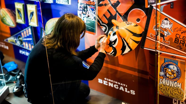
25. Cincinnati Bengals
This NFL team logo is simple yet does what it needs to do. It’s a bright orange B with black tiger stripes running through it. This is an iconic design and matches their uniforms with their black tiger stripes running across their helmets and jerseys.
This logo turned into their primary in 2004, to many fans’ disappointment, however, as their previous primary from 1997 to 2003 was a snarling tiger head. Is the B with tiger stripes a great logo? Definitely not, but if we’re judging by the current logo, this is a decent one for sure.
24. Los Angeles Rams
There are several people out there who are not a fan of the Rams logo and would rank it pretty low on the list as the worst, but personally, it’s not terrible. They rebranded in the 2020 season, with the logo itself taking a lot of criticism, and the uniforms not making it better.
The previous logo shows off a fierce ram charging, while the new logo shows off bright LA lettering, with a yellow horm circling the lettering. It’s not as great as their original logo, as the ram did enough, but the color scheme is pretty and the bright yellow horns are decent enough.
23. Chicago Bears
Stepping away from the logos that don’t hold much character, we’re hitting one of the most iconic logos in the NFL team franchise. The Chicago Bears originally had their C which is seen on helmets as their primary logo, but in 2023 fans got the exciting news that the iconic blue and orange bear logo is now their primary.
The bear has been a co-primary mark for years, and now with it being the main primary, the brand can explore more creative designs with retail, media, and marketing. It might be a minor change to some, but personally was an amazing choice.
It’s a beautiful design and one that deserves to be focused on. The only reason the Bears are still so high on the list is just because they recently changed their logo, as the C was still the main logo for too long.
22. New England Patriots
I’m not a fan of the Patriots, but I must admit they have a decent logo. Of course, their name and logo might not be as iconic without Tom Brady and Bill Belichick, but as someone who hates Brady, it’s hard to put them in a higher spot for NFL team logos.
I do enjoy, however, that it’s a beautiful design that shows off Pat Patriot in a new form and all of his glory and is shaped like a pennant, making it a perfect symbol for their team.
21. Green Bay Packers
A bold design, and an iconic design, but still a basic one. The first version of the Packer’s G design made its debut in 1961, and several teams throughout all sports have mimicked its design.
The Packer’s color scheme is beautiful and incredibly recognizable, and the simple G logo on their helmets is recognizable among all NFL fans, but is it doing enough? Personally, I love it, it’s a classic, but I could see where a few changes could help create a more throughout logo and design.
20. Tennesee Titans
Taking some heavy inspiration from their home state, the Titans did a decent job at their logo, making it a middle-of-the-road rank for NFL team logos. The colors, with the two different shades of blue, red and silver come from the state flag.
The three stars surrounding the T are also associated with the flag, making it a true logo for the state and franchise. The Titans haven’t changed their logo since they changed their names from the Oilers, but it’s one logo that doesn’t need any improvements.
19. Houston Texans
The Texans are the youngest in the NFL franchise and have only one primary logo throughout its history which makes them incredibly recognized. Like the Titans, the Texans highlight the Texas state flag with red, white, and blue.
It’s also an iconic logo with a bull, a symbol that really highlights the state. The bull’s eye is shaped like a star, referring to the nickname of the “Lone Star State”, the best way to highlight their history compared to the Cowboys.
18. Arizona Cardinals
Another NFL team logo that really shows off their franchise is the Arizona Cardinals. The logo is simple, but does more than just initials, with a bright red cardinal head at the center.
This logo was debuted in 1970 when they were still in St. Louis, but have only made minor adjustments since, with the most recent being a redesign of their uniforms in 2005.
17. Atlanta Falcons
The Falcons have done a great job with their logo, sitting in the middle of the NFL team logo rankings. I think it’s clever and unique and deserves a decent ranking. It’s also a great evolution from their original logo from 1996.
The newer design maintains the subtle F shaping but makes it sleeker and more fierce. The logo shows off a falcon with its claws jutting out as if chasing prey. The red and black contrast is amazing and modern, and with it paired with the black jersey, it’s just stunning.
16. Baltimore Ravens
The Ravens are another logo that has some amazing contrasting colors that really make it pop. The gold B and highlight inside the purple raven with red eyes are bold and strong.
Even their wordmark with the beautiful font, and a V in the shape of a claw or beak, really highlights their branding. Their color scheme here really does their logo justice, and it’s pretty intimidating, similar to the Falcons.
15. Jacksonville Jaguars
As you might tell, I really enjoy it when the name fully matches their logo. The Jacksonville Jaguars is one of those teams that have done so. The color scheme of the blue jerseys with the bold, roaring jaguar on their helmet is gorgeous together.
It’s an intimidating logo that screams the franchise. I love the fact that they’ve included a blue tongue to incorporate the colors. This design debuted in their redesign in 2013, and they did a great job.
14. New Orleans Saints
Another thing you might tell is that I don’t totally love simplicity, especially not in football when a logo is supposed to represent the team and area they’re from. I do have exceptions though, and the Saints are one of them.
While their NFL team logo might be similar to the Colts and Cowboys, with one plain symbol, it’s much more distinct as they use the fleur-de-lis, which is a common heraldic charge in the shape of a lily. The Saints joined the NFL in 1967 with this logo, and have only had slight redesigns, like one in 2000, and is an iconic NFL team logo that deserves its higher position.
RELATED: Tallest NFL players right now and the tallest ever
13. Carolina Panthers
Similar to the Jaguars, the Panthers have an iconic and perfect design that represents the team well. The roaring black panther with a light blue highlight looks fierce and pairs perfectly with their blue, black, and silver jerseys.
While they’ve had this design for years, they recently had a redesign in 2012 to create a more realistic, less cartoony logo, which was a great choice.
12. Denver Broncos
Another team I’m simply not a fan of is the Denver Broncos with an NFL team logo that I can’t deny is pretty solid. Like several of the other teams showcasing their iconic animal logo, the Broncos highlight their Bronco logo with great orange and navy blue contrasts.
This is definitely a team that has earned a decent name, especially thanks to Manning. While several believe that it’s been a little too long with the same design and it’s in dire need of a change, I think it does the franchise well and is one of the better NFL team logos.
11. Seattle Seahawks
The Seattle Seahawks have an incredibly sleek look to it and goes very well with their color scheme and jersey designs. Like the Commanders, Seattle moved away from their original, Native-American logo in 2002 and created this logo, and showed that if you make a redesign to ensure there’s no controversy, you don’t need to go for basic and simple.
The seahawk highlights their colors with a great navy blue, silver, and green eye bird that matches their blue helmet and is perfect for any color jersey.
10. Minnesota Vikings
The Viking is a classic NFL team logo, one that anyone can pick out. The classic gold and purple man with the braids and horned helmet is beautiful, and let’s not even talk about their wordmark with the Viking-esque vibe.
The Minnesota Vikings have done their team justice with this symbol and it stands strong as one of the best. They’ve kept their core design for years, and while they’ve added some things here and there, they haven’t stepped away from what works. This is the perfect logo for a state that has a high population of Scandinavian descendants.
9. Philadelphia Eagles
Another animal logo that just works. From the color scheme of midnight green, silver, and white, this is a great design that is highly recognizable.
If you enjoy the Falcons, you might look into the Eagle a bit and notice the hidden E on the right side where the feathers jut out. It’s fierce, intimidating and takes the first spot in the single-digit NFL team logo ranks.
8. Detroit Lions
An NFL team logo that was introduced in 1970, the reared-up lion has been tweaked and worked on for years, with the most recent being in 2008 that removed the black outline for a cleaner look.
The color scheme of blue and silver makes this logo look a bit simple, but with so many silver highlights, it creates enough dimension that it isn’t plain and boring. It’s not as fierce as others, but it’s a great-looking design.
7. Pittsburgh Steelers
Paying tribute to the massive steel industry in Pittsburgh, the Steelers have another iconic design in the NFL franchise.
They have a classic logo that everyone knows that first appeared in 1969, with only minor details added since like the outlining. While the three stars in the logo don’t match the color scheme, it works, and it makes the logo pop a bit more.
CHECK OUT: What Is the History Behind the NFL Logo?
6. Tampa Bay Buccaneers
The skull flag is one of the best designs in NFL team logo history. The first of its designs debuted in 1997, and Tampa Bay was redesigned in 2013 with an angrier-looking skull and a less tattered flag with a brighter shade of red.
The newest edition happened in 2020 and coincides with Tom Brady’s arrival, restoring the darker red version. And not only is the skull flat have crossing swords with a football in the middle, but the flag is also perched on a sword, a great detailed logo that deserves a high ranking.
5. Miami Dolphins
An NFL team logo that has received different thoughts from being the worst and best is the Miami Dolphins. Personally, it’s definitely one that deserves a higher spot due to it not only being a dolphin, associated with the same but has a radiating sun in the background to represent Miami, Florida.
While the original logo was a bit more cartoonish, the redesign in 2013 created a more realistic look, and looks a lot better, making it one of the best-ranking NFL team logos.
4. Las Vegas Raiders
Speaking of swords in the Buccanneers logo, we have the Raiders which show off swords crossing over a man wearing an eye patch, a logo that debuted in 1995.
While the team originally had gold in the early 60s, it didn’t take long for them to refine their logo, creating a much more sleek design.
3. Buffalo Bills
A charging bison would be terrifying in person, and it has almost the same effect as the Buffalo Bills logo, one of the best-ranking NFL team logos on the list.
The blue and red bison charging beats many of the other red, white, and blue schemes in the franchise. While the logo has managed to last for 50 years, it still holds strong and doesn’t see any sign of changing any time soon.
2. Los Angeles Chargers
This is what I mean when I think simple is better. A simple lightning bolt for the Chargers logo does well, especially with the bright yellow and the simple blue highlights. It’s an iconic symbol that first showed up in the 1961 season, and took until 2002 for the team to make it the only logo.
And like the Rams, who also made a redesign for their brands during the move into SoFi Stadium in 2020, the Chargers killed it while the Rams struck out. The new bolt is less curved and only has one outline instead of two, a great improvement for an already great logo.
1. Kansas City Chiefs
Am I biased? Of course. Without a doubt. As a Chiefs fan, they have by far the best design. It’s simple, it’s sleek, it says everything without doing too much. The simple KC lettering is bold and pops with the red color, and the arrowhead surrounding it with a bold black highlight is everything you need.
The current logo was created in 1972 when they changed moved from Dallas to Kansas City, Missouri. It’s bold strong, and unchanging over the years during their stay in Missouri, and hopefully will not be changing anytime soon.