Some of the biggest fans of the National Football League may not know the history behind the NFL logo. In fact, you may never have noticed that it once looked different than it does now. That is because the NFL, after being established in 1920 as the American Professional Football Association, developed a logo that is pretty similar to the famous shield we see today. Let’s jump into the history of the NFL logo and how the current design represents the importance of the American sports league.
Story Behind the NFL Logo
The NFL has been around for 103 years. As a result, it is a professional sports organization that has grown and evolved along with its representation among Americans. Their logo is a big part of that as it symbolizes what the organization stands for.
When the NFL was first established in the 1920s, they were not the only football association in America. The NFL actually survived a few competing football leagues over the decades to come. Its popularity began to rise in the 70s when the American Football League (AFL) merged with the NFL. As a result, the NFL became the dominating space for football, but it wasn’t always that way.
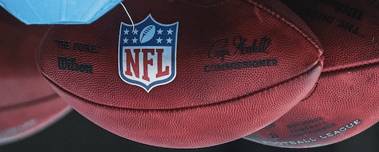
When the logo was first created, there wasn’t much information or marketing surrounding the design. However, the logo is best known for the shield shape that can be seen from the 1940s to the present day. When we look at the current NFL logo, the shield encapsulates the power and prestige of the NFL. Not only is this because it literally holds the letters of the NFL, but also because shields represent protection, toughness, and strength.
The logo also features America’s colors of red, white, and blue, which was an intentional choice. The NFL is a huge part of American culture and pride, so the logo uses these colors to represent that exact patriotic feeling.
Lastly, the final two elements of the NFL logo that hold significance are the stars and a football. Stars have been represented on most of the NFL logo designs, which also resemble patriotism similar to the stars on the American flag. However, the number of stars has changed over the years and the current logo only has eight. This represents the number of divisions in the current-day NFL. The inclusion of a football has always been a part of the design, which may seem obvious. However, it not only represents the sport itself, but also the Super Bowl. The way the football is drawn closely resembles the Lombardi Trophy, which is each NFL team’s ultimate goal.
All of these features were hand-selected for the NFL logo on purpose and have evolved to create the logo we have today. You can often find the NFL logo on players’ helmets, shoulders, jersey collars, and pants as well as on the field, of course.
RELATED: Best NFL Jerseys in 2023: All 32 Teams Ranked
History of the NFL Logo
When looking back at the history of the NFL logo, it is clear that the league always wanted to represent its intentions for success in the sport.
It’s important to note that the graphic above is a representation of what the NFL logos looked like as they evolved. Since there is little known about the logo before 1940, these graphics are an estimation whereas the 2000s logos are accurate to what we’ve seen in the game.
Back to the history. What we can clearly see is that the shield design took off in 1940. Interestingly, there is not a known designer for this creation. The meaning behind the shield resonated with the league and its fans, which is why it has never left the NFL’s brand identity.
History of the NFL Logo: Through the Years
Next, we will explore the specifics behind each design that is known to us and why the logo underwent an update.
1920-1930s
There isn’t much known about the NFL logo during this time because the league was mainly focused on gaining notoriety for its ten practicing teams. Each of these teams had logos at the time, but the NFL logo wasn’t in the front of anyone’s mind. It is thought that the shield shape did exist during this era but did not appear on the players’ uniforms or other gear.
1940s
As we’ve mentioned, the 1940s is the first time that we can trace back to evidence of a shield-based logo. It is also said that this logo kept the red letters of the “NFL,” but added pink pinstripes to the background. Since pink didn’t exactly correlate to the patriotic colors of the league, it didn’t stick around for long. What did remain is the 25 stars behind the football. This was an interesting choice because there doesn’t seem to be a meaning behind that particular number, but that starry background stayed on the logo until 2008.
1950s
In the 1950s, the NFL logo brought back the red stripes and played around with its sizing and boldness. Once again, the shield, stars, and football features saw no change. The main point of change in the logo before the 70s was the pinstripe background.
1960s
#OTD in 1969 the @steelers, @Browns and @BaltimoreColts agree to move from the NFC to the AFC in the @NFL . Also, found this 1969 NFL 50th Anniversary logo. Never seen it before. Very cool! #NFL #OTDinNFLhistory pic.twitter.com/mWT9334m0J
— OTDinNFLHistory (@OTDinNFLHistory) May 17, 2018
The 1960s variation of the logo still included pinstripes. However, that is until the NFL created a special 50th-anniversary logo that became well-known among the football community. Shown above, this logo can be seen on NFL players’ jerseys during that time. In a way, the anniversary logo is more recognizable than the official 1960 one.
1970s
The big change to the NFL logo came during the 1970s. The league removed the red stripes behind the “NFL” and this version became a bit more clean-cut. This version begins to shift the design in the direction we now have today.
1980-1990s
During the next three decades, the NFL logo did not change as much as it used to. The changes from the 1970s to the 1990s were very minuscule and only related to the color and thickness of the font.
2000s
During the 2000s, specifically in 2008, the current NFL logo was designed. This version kept the original integrity behind the NFL logo design, but polished it up and added even more purpose. For example, it removed the 25-star background and replaced it with 8 stars to represent each NFL division. There is no mistaking the edits to the drawn football to look even more like the Lombardi Trophy. The logo also opted for a navy blue as opposed to the brighter blue that had been used in years past. The 2008 NFL logo has lasted until 2023 and is instantly recognizable as the look behind the NFL brand.
Variations
Outside of the changes through the decades, the NFL logo has seen a few other special variations that call attention to a certain celebration or cause. For example, the NFL has put out several anniversary logos for a temporary special edition. Also, every year, they add a pink ribbon for Breast Cancer Awareness Month. These are two examples of how the logo has adapted to special circumstances.
ALSO READ: Highest paid NFL players in 2023
When looking back at the history behind the NFL logo, it is super interesting to see its unvarying design over the last 100 years. The NFL represents America’s most popular sport, so its logo has to be memorable and powerful. Even the original iterations of the logo kept that in mind and led us to what we now have as the constant symbol of the sport.