The NFL has been going strong for decades, all the way back to 1920. With so many teams and unique identities, there are bound to be changes when it comes to personalization. And don’t forget that many teams have moved locations.
That being said, a lot of logos need some freshening up to make way for their new seasons. But what are the most changed NFL logos in the history of the franchise? After checking out each team throughout the years, I found a decent amount of NFL logos that have changed the most after so many years.
RELATED: Ranking Every NFL Team Logo
Parameters
With 32 total teams throughout the NFL, there are a lot of teams that have made changes over the years to their logos. Of course, some have stayed true to their design and haven’t strayed, but most have tried out something new and fresh.
But if we’re talking about the logos that have changed the most, it would be unfair to include all teams as some have only made slight alters. Below is a list of NFL teams that have done the most when it comes to changes.
These logos look nothing like the first logo they ever bore, something drastically different. The teams that have only made minor changes or are still relatively similar to their main logo will be left out.
Which NFL Logo Has Never Changed?
There have been some teams that have stuck to their guns when creating logos. For instance, the Texans and Jaguars haven’t changed since their creation.
The Texans logo was adopted in the early 200s and debuted with the team. Since then, it hasn’t changed much. The Jaguars debuted in 1995 and tried to keep themselves apart from the Ford Motor Company and its logo, so opted for a snarling Jaguar head with a teal tongue, which has since been the staple.
Most NFL Logo Changes
16. Cleveland Browns
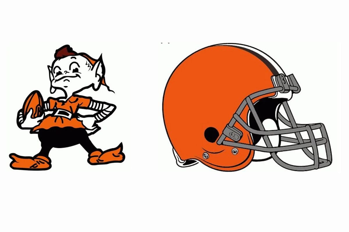
The Cleveland Browns are the first on the list of the most NFL logo changes over the years. The franchise was founded in 1944 and began to play in 1946. They are the only team with no logo on their helmet and use the blank orange helmet as their logo.
Their name and logo reflect the history of their original coach, Paul Brown. The color and logo aren’t about flash for them, but about legacy, dedication, and history. The debut logo featured a little elf named “Brownie”, but eventually was taken away for a less flashy logo.
And since then, all the team has gotten is different color changes. While their current logo is rarely changing, the difference from Brownie to their blank helmet is quite the change.
15. Buffalo Bills
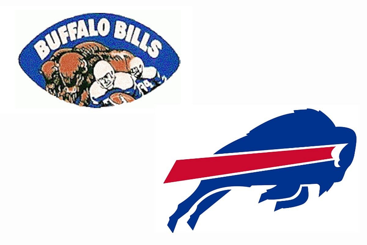
The Bills have had five logos within their 60+ years in the franchise. Their current logo, designed by Steven Wrights, was created in 1974 and is the iconic bison charging, which symbolizes strength, determination, and power. The red streak is supposed to signify motion and speed.
This emblem has remained unchanged since. But before there was a bison, there was the blue emblem which showed a blue football frame that included a herd of buffalo charging along with players.
This NFL logo was in the 1960s, but in 1962, there was an updated version that showed off a brownish-tan buffalo silhouette with one single buffalo in the background, with one player in uniform at the forefront. But even that one didn’t last long, as in 1970, the Bills went for the red emblem, which was just a standing bison in bright red. And from there, the rest is history with the current logo.
14. Denver Broncos
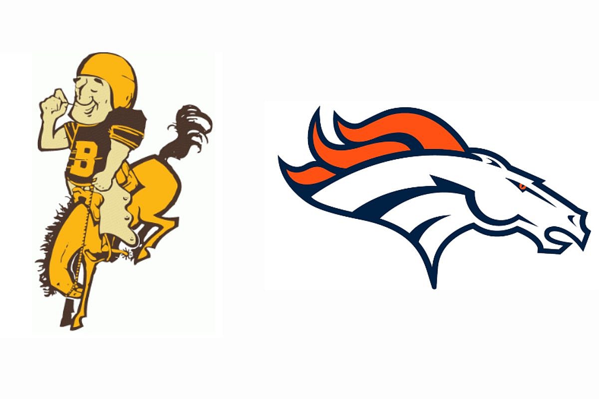
Another NFL logo change that has gone through the most is the Broncos. While there is still a bronco in both logos and has always been in the logos, it still is a drastic change from the 1960s logo to the present logo that we know and love today.
When looking over time, you can see that the Bronco’s logos have gone under a lot of change to make it more fierce, more intimidating, and stuck to what worked for them, the Bronco. The first logo featured a man riding a horse, but it felt laid back and relaxed. The color pallet was also more bland than what we know currently.
And then from 1962 to 1969, we had a football player riding a horse with a more cartoonish art style. From there, the 1970 to 1996 stretch featured a bright orange D with a horse in the middle. But now, the iconic NFL logo was created in 1997 and is still what fans know today, and it works well for them.
CHECK OUT: Highest-Scoring Super Bowls in History
13. New York Jets
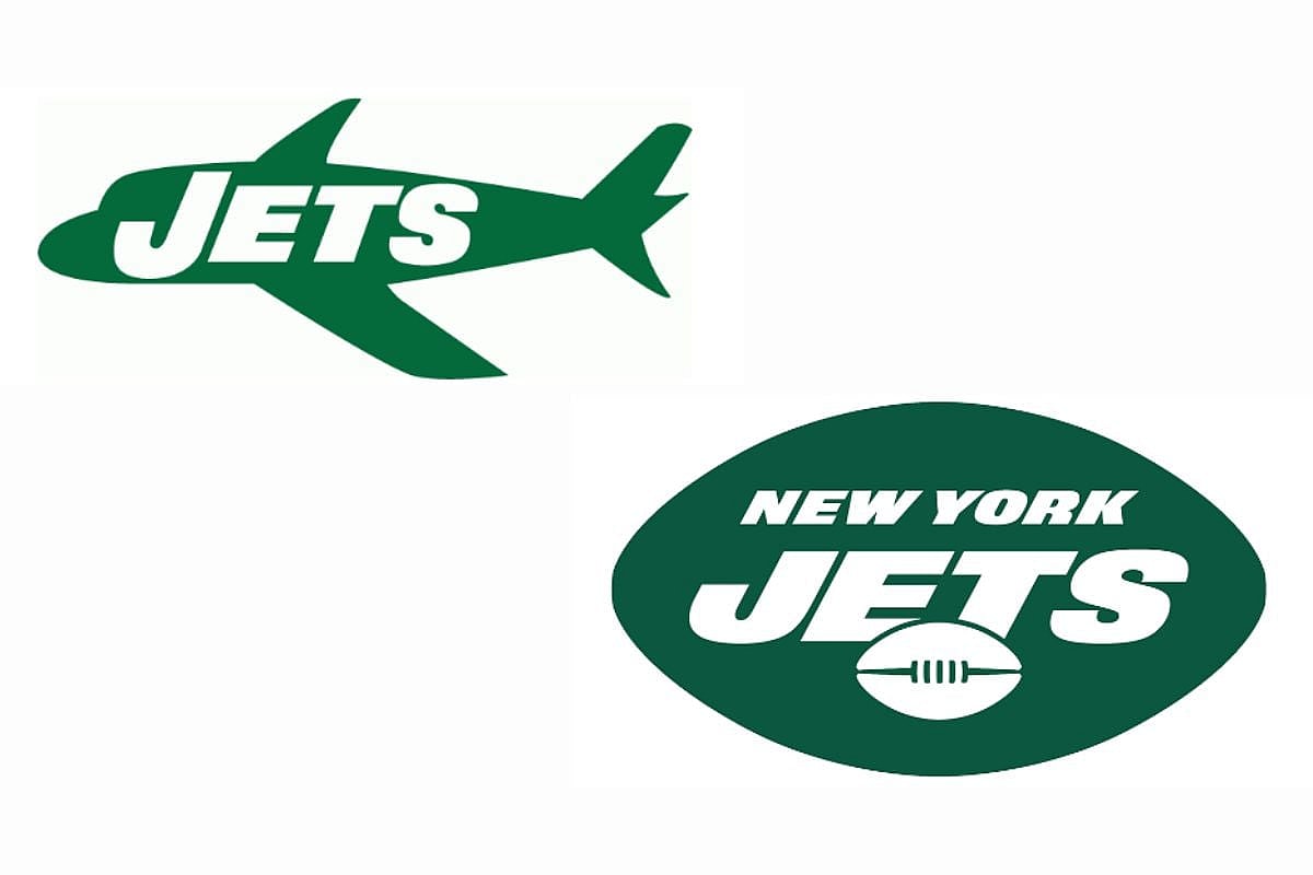
I want to preface before getting started that the 1963 logo above with the green jet is not the Jets‘ debut logo. The beginning was in 1960 to 1962 when a football player was on the left of the writing that had tan-ish “Titans” wording, and then “Of New York” below it in black.
This was the team before the New York Jets came around, but is still part of their history. After playing only three seasons at the Polo Grounds, the team changed its name to the New York Jets and moved into the newly built Shae Stadium in 1964.
This is where they received the new logo shown with a green jet, and from there, green took over. In 1965, the Jets officially began their journey with the silhouette football with the NY Jets inside, and by 2019, the Jets reached their current logo, with several tweaks along the way.
12. Green Bay Packers
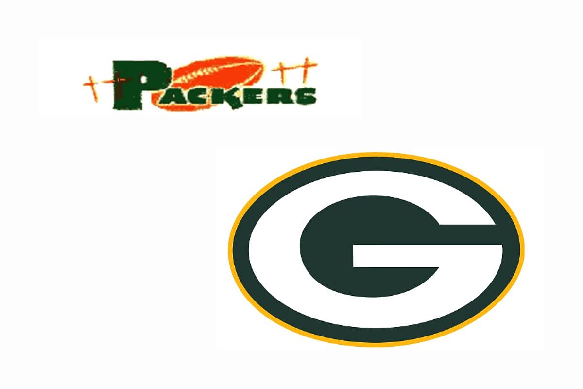
Speaking of a lot of green, it’s only fair that we divert our attention to the Packers, another great team that has received a lot of NFL logo changes. The team began its time in the NFL in 1919 and is the third-oldest franchise in the NFL. Home games have been played at Lambeau Field since 1957 and they have the most wins out of the NFL franchise.
Their logo was incredibly simple, with a football in the background with blocky green “Packers” at the forefront. This logo was their main logo from 1951 to 1955, but in 1956 they changed it up with a tan football with their state inside in green, and a football player inside the state. It was a bit busy but did the job.
In 1961 we saw the first version of the current logo, with a big white G surrounded by green. And then in 1980, the current logo was created, which is the same design, only with a yellow outline.
11. Los Angeles Chargers
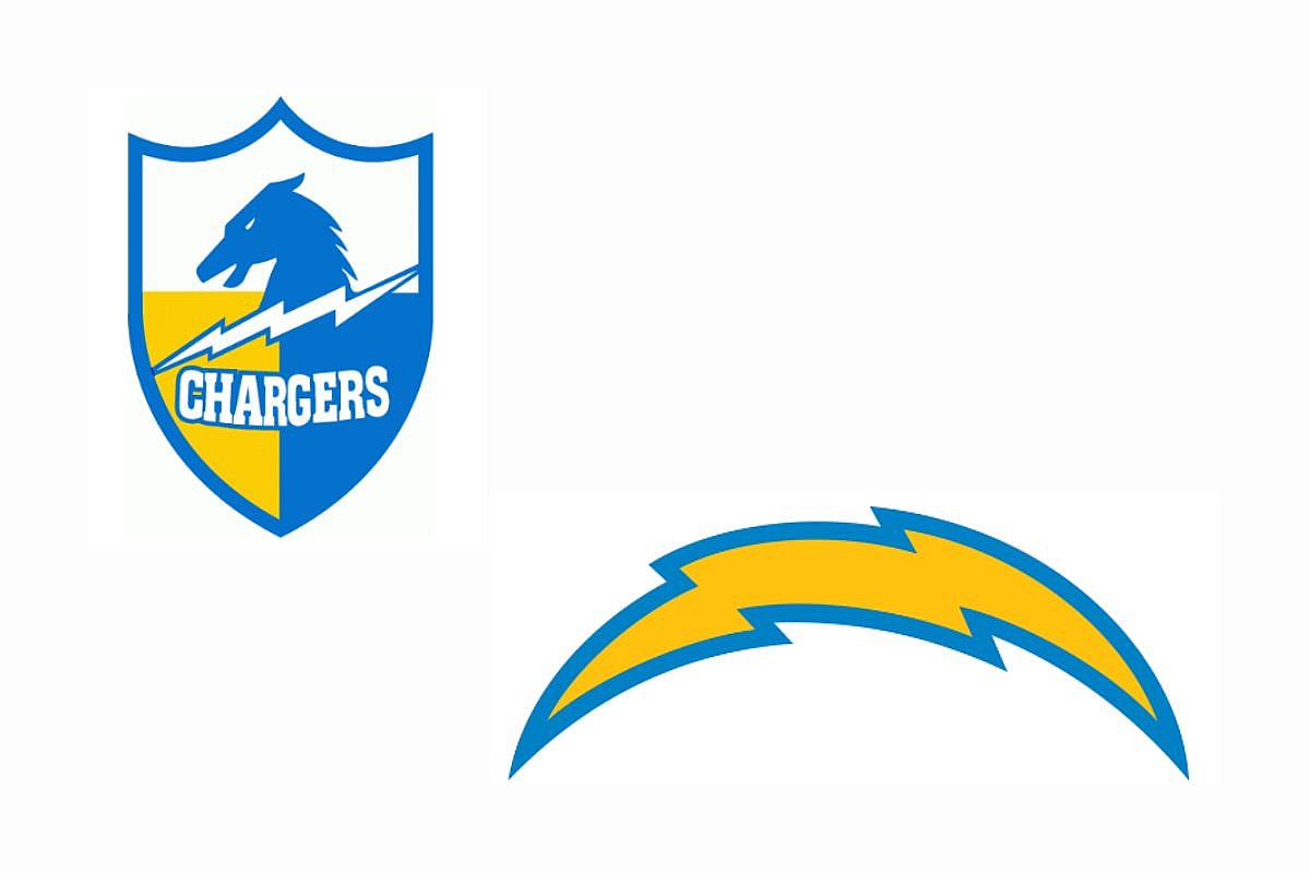
The Chargers is another team with a logo that has been around for a while, but it didn’t start that way. The team was founded in 1959 and began to play in 1960 as a charter member of the American Football League. They spent their first season in Los Angeles before relocating to San Diego in 1961 to become the San Diego Chargers.
Their debut logo features a horse with a lightning bolt decked out in their team colors, blue and yellow, but eventually moved on to their iconic lightning bolt across their helmet, which was first seen in 1974. As the years went on with the team, their lightning bolt stayed, but the design just tweaked a bit. They had a darker yellow, almost orange in 1974, and then a white bolt with yellow and blue highlights in 1988 and 2002.
By 2007, the famous yellow lightning bolt with blue trim was seen. In 2017, they changed their logo completely to LA, with the L featuring the bolt at th
10. Cincinnati Bengals
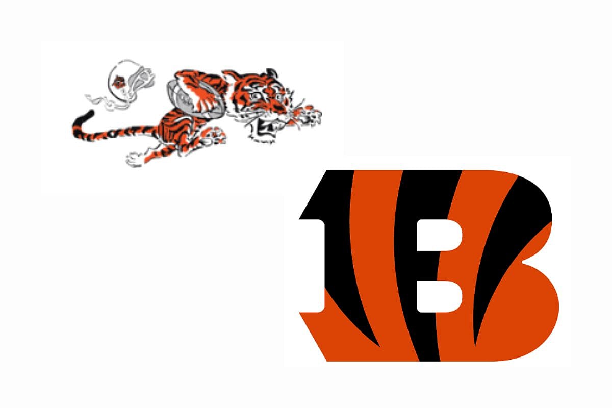
The iconic Bengals uniforms feature a lot of tiger stripes, which fully bring out their true ferocious nature. And while they truly have the Bengal spirit, they have one of the biggest NFL logo changes.
They began their career in 1968 with an adorable, fierce tiger running with a football and a helmet flying off, but by 1970, the kitty was gone and changed to a helmet with the word Bengals on it. They quickly surpassed that idea and featured an orange helmet with tiger stripes across it.
This changed for a while, and by 1997, the logo changed to a Bengal. In 2004, we have the current logo that has an orange B with tiger stripes, sharing the same design as their uniforms.
9. Indianapolis Colts
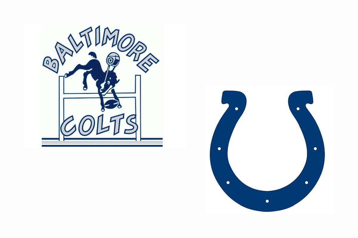
Before the Indianapolis Colts were a thing, there were the Baltimore Colts. And while the current Colts have one of the most boring designs, in my opinion, they have a big NFL logo change throughout their career.
The Baltimore Colts featured a horse leaping with a football and helmet. By 1961, the logo changed slightly to remove the words and the bar, leaving just the horse, football, and helmet. Somewhere along the lines, the team decided to create a minimalistic logo in 1979 to just a horseshoe. It’s simple, it’s classy for some, it’s… a horseshoe. This is one NFL logo change that I wished didn’t happen.
8. Tampa Bay Buccaneers
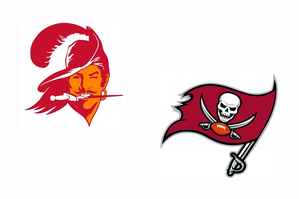
The Buccaneers have a great logo, and their older logos were even better if you can believe it. While the present logo, which was introduced in 2020, features a pirate flag and a skull, and cross swords with a football, the older logo, which was presented in 1976, has a creamsicle-orange person named “Bucco Bruce”.
He’s cute and suave, but some might think he’s not fierce enough looking, and fierce is one thing that a lot of NFL teams strive for. While the Buccaneers haven’t had a lot of different logos, as their Bucco Bruce was changed in 1996 to the flag we know and love, there have been several tweaks throughout the years to the current position. And let’s be honest, looking at the 1976 logo and the 2020 logo, it’s a pretty big difference, even if it’s along the same theme.
7. Arizona Cardinals
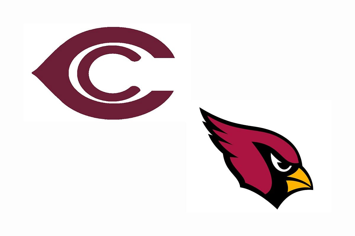
If you’re not aware, the Arizona Cardinals didn’t initially begin in Arizona, they started in Chicago, which answers why their very first logo was a C within a C. That logo stood strong and true from 1920 to 1934. In 1947, fans saw their first look into the cardinal, perches on a football.
By 1960, the Cardinal had become a bit more mobile, dashing across. 1970 is when fans saw the very first depiction of what the current logo would be, with a Cardinals head looking rather angry. From 1970 to the present day, there were several tweaks to create the modern, sleek, and intimidating look that we are all familiar with.
6. New England Patriots
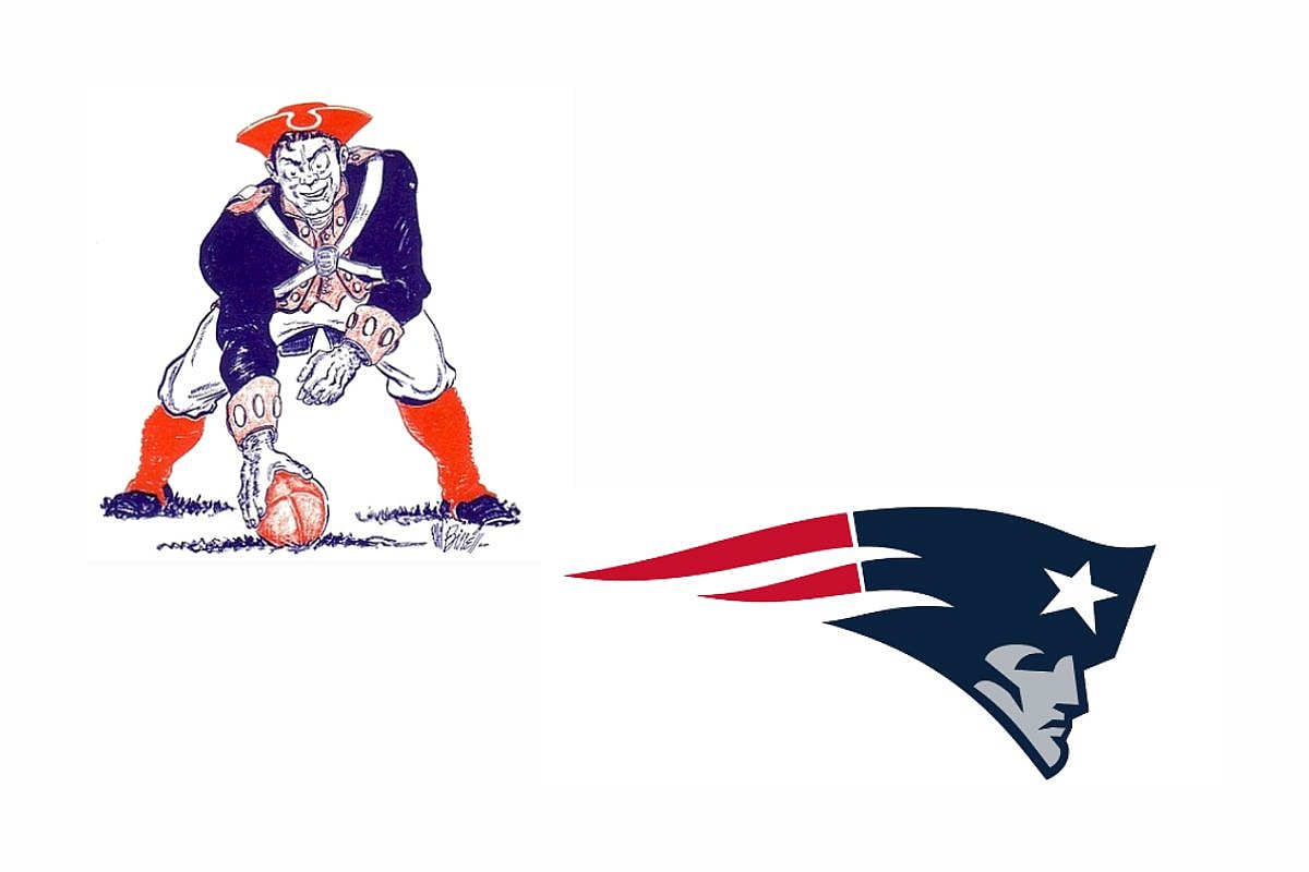
I feel like several fans of the NFL are aware of the original New England Patriots logo. One of the biggest NFL logo changes is with the Patriots, who changed up their amazing Pat Patriot to a simple and sleek design. Pat the Patriot is the mascot of the Patriots, and was their logo in 1961, with him squatting down with the football.
This logo was around up until 1992, only growing in size and becoming a more clearly, depicted version of himself. In 1993, fans saw the new version of Pat’s head only with a star on his helmet. 2000 was when they presented the newer version which was bigger and had a more revamped color palette.
5. New York Giants
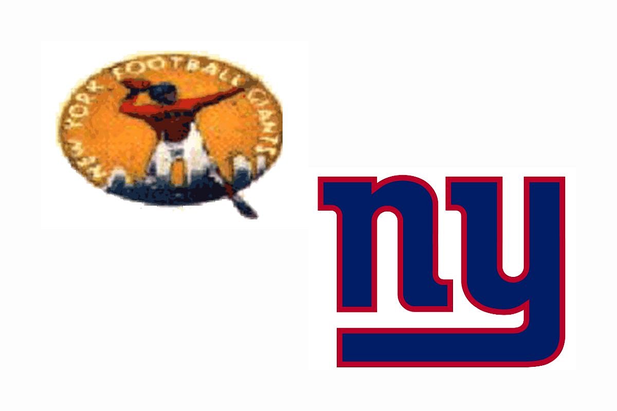
One of the most dramatic NFL logo changes goes to the New York Giants. Their current logo has the lowercase, NY, an ironic choice for their name, in bold blue and red lettering, but they started with a more detailed, busy logo.
In 1945, their team began with a logo that featured a circle with a football player towering over New York with their names surrounding the background. From there, they went with a simpler depiction, and by 1956 there was just a football player above the stadium that they played in. But soon after, in 1961, the first idea of their current logo was presented, a plain blue NY in a lowercase sitting.
4. Tennessee Titans
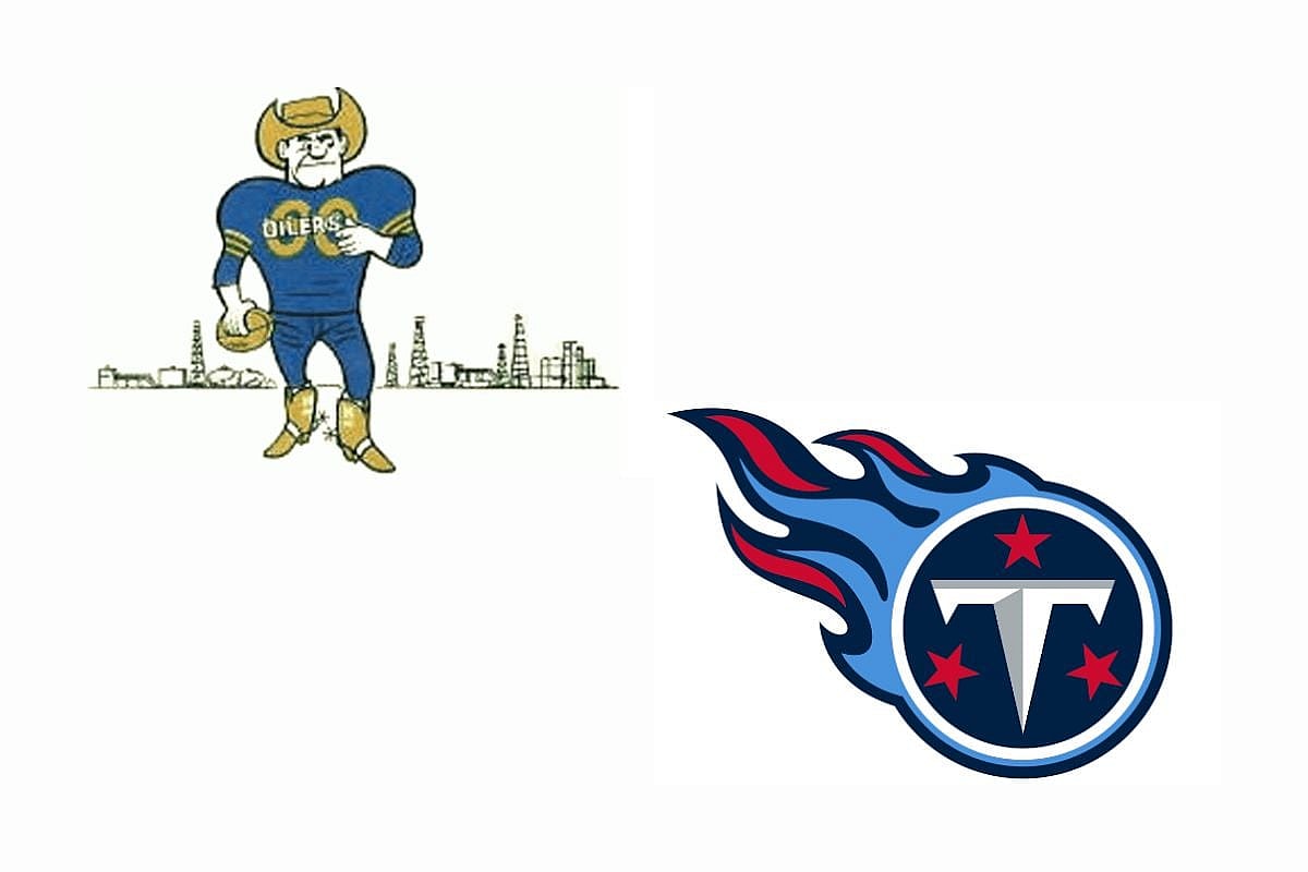
The Tennessee Titans have one of the biggest NFL logo changes just because of their team’s history. Before they were the Titans, they were the Houston Oilers, and of course, they had the logos to match. In 1960 when they began, they had a football player decked out in boots and a hat holding a football with their city in the background.
In 1961, they quickly changed the cowboy hat to a construction hat, taking away the tan color as well. And then by 1969, they worked to create more of the “Oiler” feel by presenting an oil rig as their logo. In 1999 when they became the Tennessee Titans, they changed their logo to the one you know and love.
CHECK OUT: Best College Football Stadiums 2023: Ranking the NCAA Best and Biggest Stadiums
3. Kansas City Chiefs
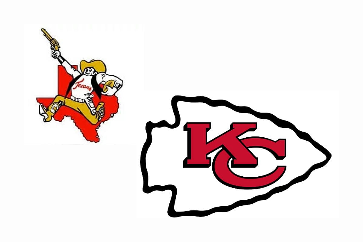
The Chiefs are another team that has had a drastic NFL logo change due to their team moving around. Before they were the Kansas City Chiefs, they were the Dallas Texans and featured a logo of the Texas state with a cowboy in front waving around a pistol.
As the team moved, so did their logo, and in 1963, the Texans relocated to Kansas City, Missouri, which had the logo change to a Kansas City/Missouri outline with a Native American, referred to as the “Chief” following the same running form as the cowboy but holding a hatchet. But obviously, that couldn’t stay. So in 1972, the Chiefs logo changed to the classic Arrowhead that fans know and love, and has stayed that way since.
2. Washington Commanders
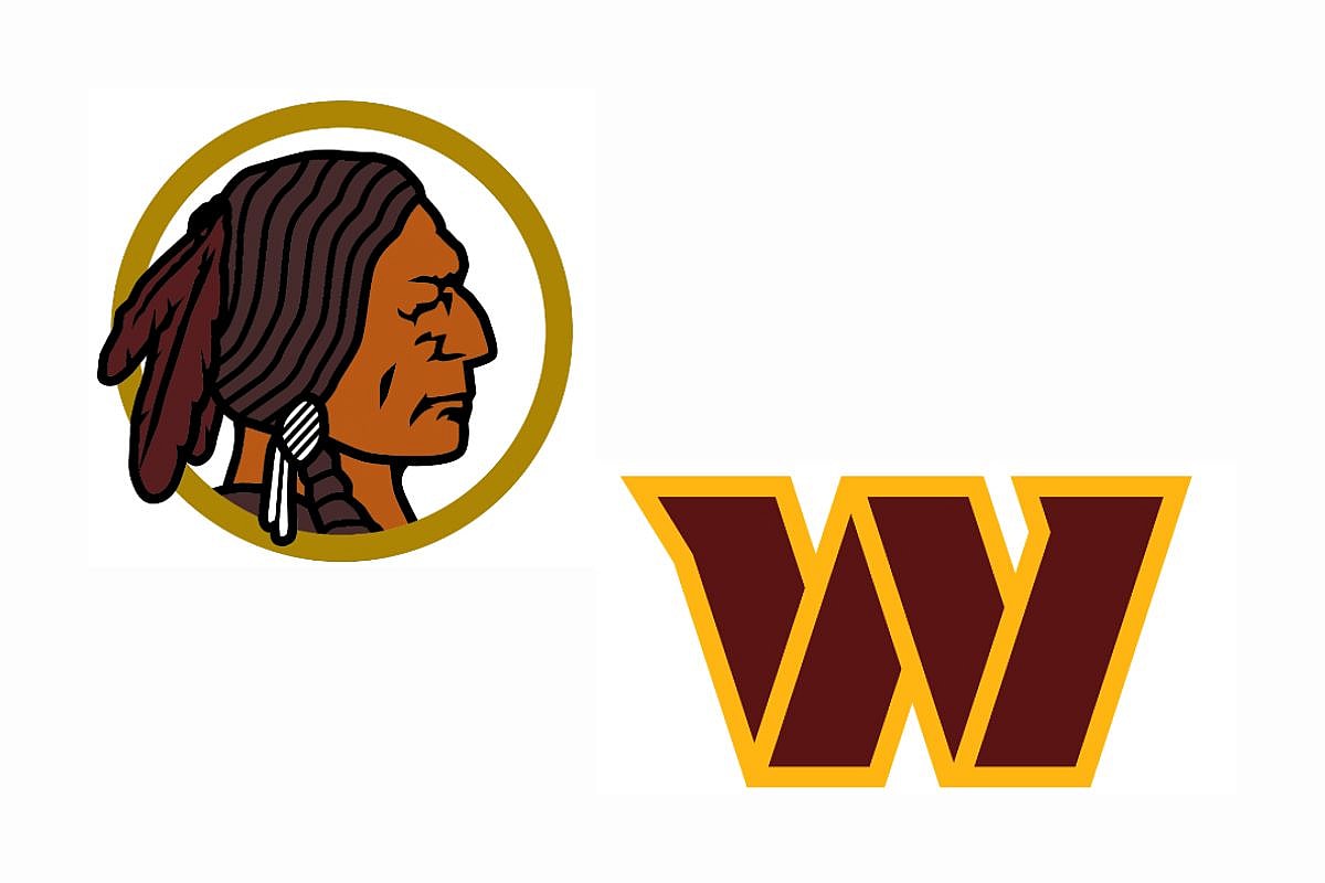
The Washington Commanders, once the Washington Redskins, had a big NFL logo change for the better. The Redskins changed their name and their logo after a pretty big controversy among Native American groups and individuals.
In the 1990s and 2000s, the attention became even bigger, until in 2022, the team decided to remove all slang, for instance, “Redskin” out of their name. Their logos, where they featured a Native American, quickly changed as well for a basic W in their team’s colors. While a drastic change, it was for the best.
1. Pittsburgh Steelers
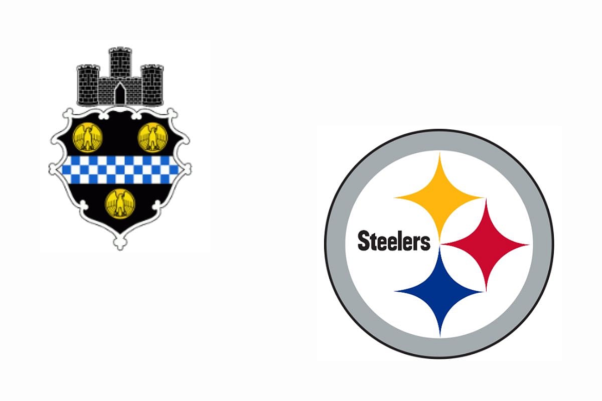
The Steelers by far have one of the most intense NFL logo changes throughout history. In 1933, they had the crest of Pittsburgh, but quickly began to create logos that highlighted their steel pride.
They had construction workers hanging onto a chain holding a pennant, and another that showed a worker punting a football on a steel beam, all highlighting the city’s history and origin. Eventually, they settled on the current look in 1969 where there was a circle, the name of the team, and three geometric shapes that each represent a raw material in the steel industry.
Conclusion
Out of all 32 NFL teams, these logos have changed the most throughout their career. From their debut to their present design, these NFL team logo changes have created better looking, sleeker, and maybe even more historical accuracy with their designs.
While most teams, besides the Texans and Jaguars, have gone through some tweaks, these by far have become more unrecognizable from their starting logo, and hope to see more changes to come in the future from some other teams.
