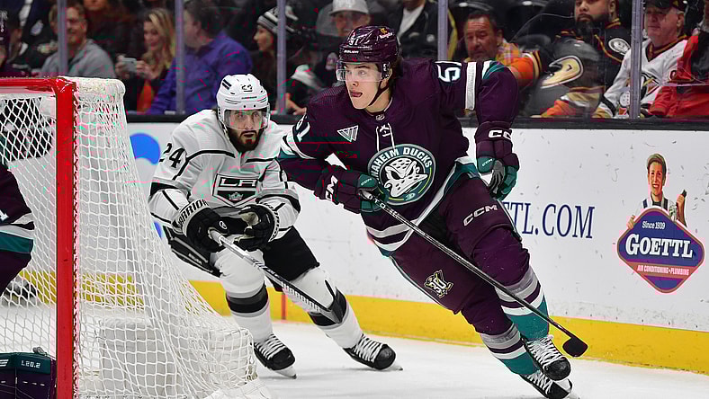
The two NHL tams from Southern California appear to be looking to their individual past to move ahead in the future when it comes to uniform changes for the Anaheim Ducks and Los Angeles Kings in 2024-25.
Reports surfaced in early June about new logos and jerseys for both SoCal hockey teams, set be revealed before the NHL Draft on June 28, where, coincidentally their North California neighbors, the San Jose Sharks, hold the first pick.
Sure, the Sharks likely will nab 18-year-old phenom Macklin Celebrini. But will their neighbors to the south steal the show with their new jersey designs?
Probably not.
Anaheim was first to the fashion show, releasing an early look into their reimagined jersey design on Monday.
Though the teaser covered most of the new logo with a nondescript orange fabric, the duck’s eye in the center was enough to hint that Anaheim shall return to a variation on the classic Mighty Ducks logo.
This is a marked difference from the black design with a yellow duck foot they’ve sported as their main jersey since 2014.
This isn’t the first time the Ducks have paid homage to the 1992 classic film which helped spawn their team. Anaheim’s alternate jerseys often feature a variation on the Mighty Ducks logo.
However, it is the first time since 2006 that look will function as their home jersey.
There are some marked differences from past Mighty Ducks logos as well.
For instance, the golden outline above the deep orange eye truly makes the crest “pop”, whereas the eye hole was previously vacant of color.
In addition, the original location of the holes on the original Mighty Ducks’ goalie mask are now gone. It’s likely the holes will take on a different pattern (or not exist at all?).
Related: Utah NHL team uniforms: timeless or tired?
Kings hope to have better support for new look than Dodgers
It’s been an interesting month jersey-wise for the City of Angels.
The Dodgers officially unveiled their City Connect uniforms on Monday, a combination of electric and cobalt blue.
One aspect of the jersey was polarizing, to say the least.
While the primary colors and font were largely accepted, the uniform is dotted with small blue, orange, and yellow spots to represent the classic seating colors of the stadium.
Angelenos are not on board.
“Can’t believe they have the guys looking like stale pop tarts,” one fan wrote.
“We already had a bad week, why do this to us now?” another griped after stars Mookie Betts and Yoshinobu Yamamoto were both placed on the injured list in the past three days.
The boys of summer may not look very cool with their new uniforms, but locals are praying the Kings will redeem Los Angeles style.
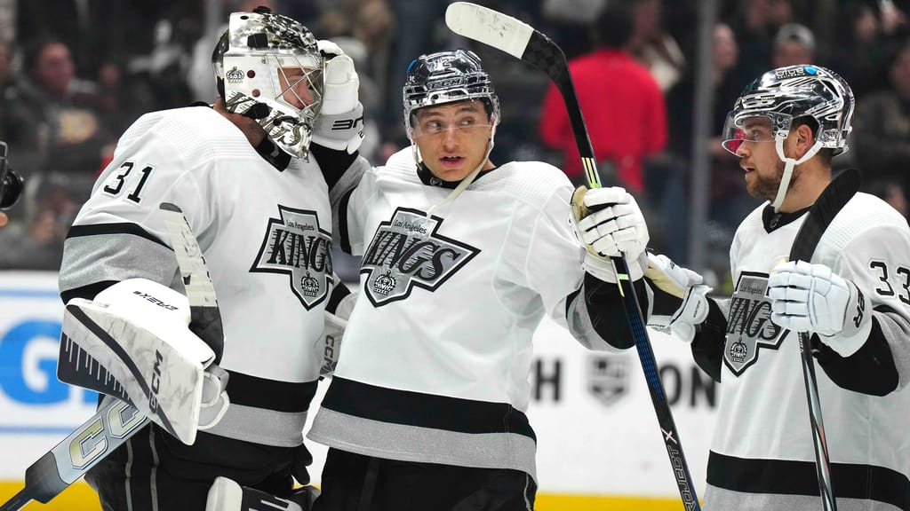
When Icestetics confirmed the redesign of the SoCal hockey teams, they announced the Kings will receive a “modernized version of the Gretzky-era logo in black and silver”.
It will also include a new design of the infamous crown.
The Kings have worn a primarily black and silver color scheme since 1988, a stark contrast to their eye-popping purple and gold kits they donned at The Forum, their original home in Inglewood.
The Kings have yet to release any kind of teaser online as to what these new jerseys will look like.
If the Ducks are any indication, L.A. will likely return to a 1990’s look with a silver plate across the chest, similar in design to their alternate sweaters from this past season.