Major League Baseball (MLB) has been around for over 100 years after the National League (NL) and the American League (AL) combined in 1903, making the MLB the oldest major professional sports league in the world. As with other professional sports, the MLB has also changed its logo to its current design over the years.
Though the MLB logo has not changed as much as other sports such as the NFL, there is still some interesting historical significance to both the logo and how it came to be.
RELATED: What Is the History Behind the NFL Logo?
Story Behind the MLB Logo
1968 was the year of the MLB logo creation, commissioned by the MLB Centennial Committee, and was introduced by the new Baseball Commissioner Bowie Kuhn to be used in the Professional Baseball Centennial Celebration in 1969.
The creator of the famous logo has a bit of a muddy history, since for many years two graphic designers claimed that they had created the piece. One contender was Jerry Dior, who worked for the marketing firm Sandgren & Murtha, while the other was Jame Sherman, a comic book illustrator.
After a closer look into the design of the logo and it’s intricacies, Sherman realized that “the logo [he] created was very similar, but [he] designed it in the early 1980s” — nearly twenty years after the fact. The main reason he didn’t know about the earlier logo was due to his lack of watching sports, so he never even saw the logo before drawing his own.
Once we clear the debacle of the creator, we can credit Jerry Dior with the complete creation of the piece. Designed in a single afternoon, the silhouette in the logo was long believed to be Hall of Famer Harmon Killebrew, but Dior and Killebrew both denied this being the case. Dior instead wanted to create an ambiguous player, created off of photographs of several players. Even the silhouette’s design bleeds ambiguity because the batter could be left or right-handed and have any ethnic background.
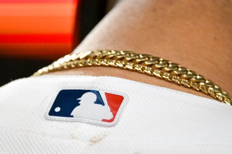
Of course, the finishing touches to the white silhouette were a red and blue block background to complete the logo design, and it’s the colors of the logo that have been the only things that changed.
CHECK OUT: Which NFL Logos Have Changed the Most?
History of the MLB Logo
As you will see when you scroll further through the article, there is a timeless design to the MLB logo that never seems to change, only the colors do. I think it’s incredible that a design created in one day could last over 100 years, and influence other professional sports to create their logos in similar designs to this one. It not only shows the importance of creating a logo that represents all players in the franchise, but at the same time is simplistic and recognizable.
History of the MLB Logo: Through the Years
As you can see from the logo diagram created by 1000logos.net above, there have not been many changes to the overall look of the MLB logo. The main difference between the three eras of the logo is the colors, changing from a lighter to darker blue, and the red changing shades as well. The one thing that remains is the batter and the split two-color design, which is rare in the logo industry.
Most companies change at least some part of the design, but the MLB logo is ageless and ambiguous, probably playing a large part in why it’s never been changed. This design has also been applied to other sports, with the red and blue (or another two-color scheme) blocks and a silhouette of either a player or a piece of equipment vital to the sport. These include the NBA, Minor League Baseball, WNBA, U.S. Figure Skating, Hockey Canada, American Hockey League, and others.
ALSO READ: Richest NFL Owners in 2023 From Saints to Broncos
Variations
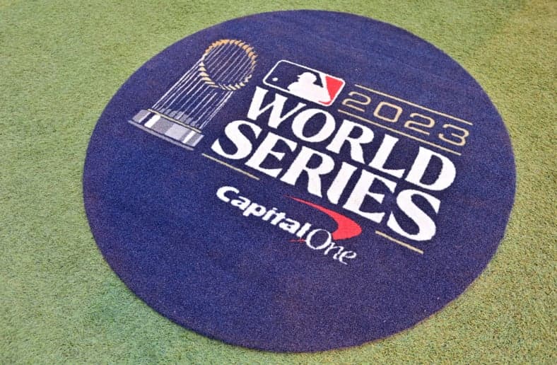
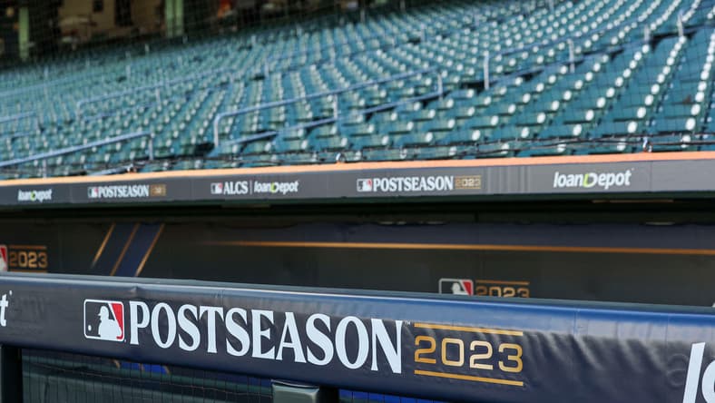
There are several types of variations for the MLB logo. Some of them can just be adding text like “postseason” or “World Series” like the image above, but others can take a completely different form. Some of these different logos include the centennial in 1939, MLB 150 years in 2019, and Jackie Robinson anniversaries for 50 and 75 years.
Instead of the signature baseball silhouette, they may have the World Series Cup in the background or Jackie Robinson’s silhouette for his anniversaries. One thing they all have in common is the colors — always including the staple red and blue, and most of the time there is white in the logo too.
CHECK OUT: Ranking Every NFL Team Logo
Even though the MLB logo hasn’t changed much over the 100 years it’s been used, there is still a unique history behind how the logo was created and who designed it. The ambiguity allows for all players to be recognized under the same banner, and be proud to play for the Major Baseball League.