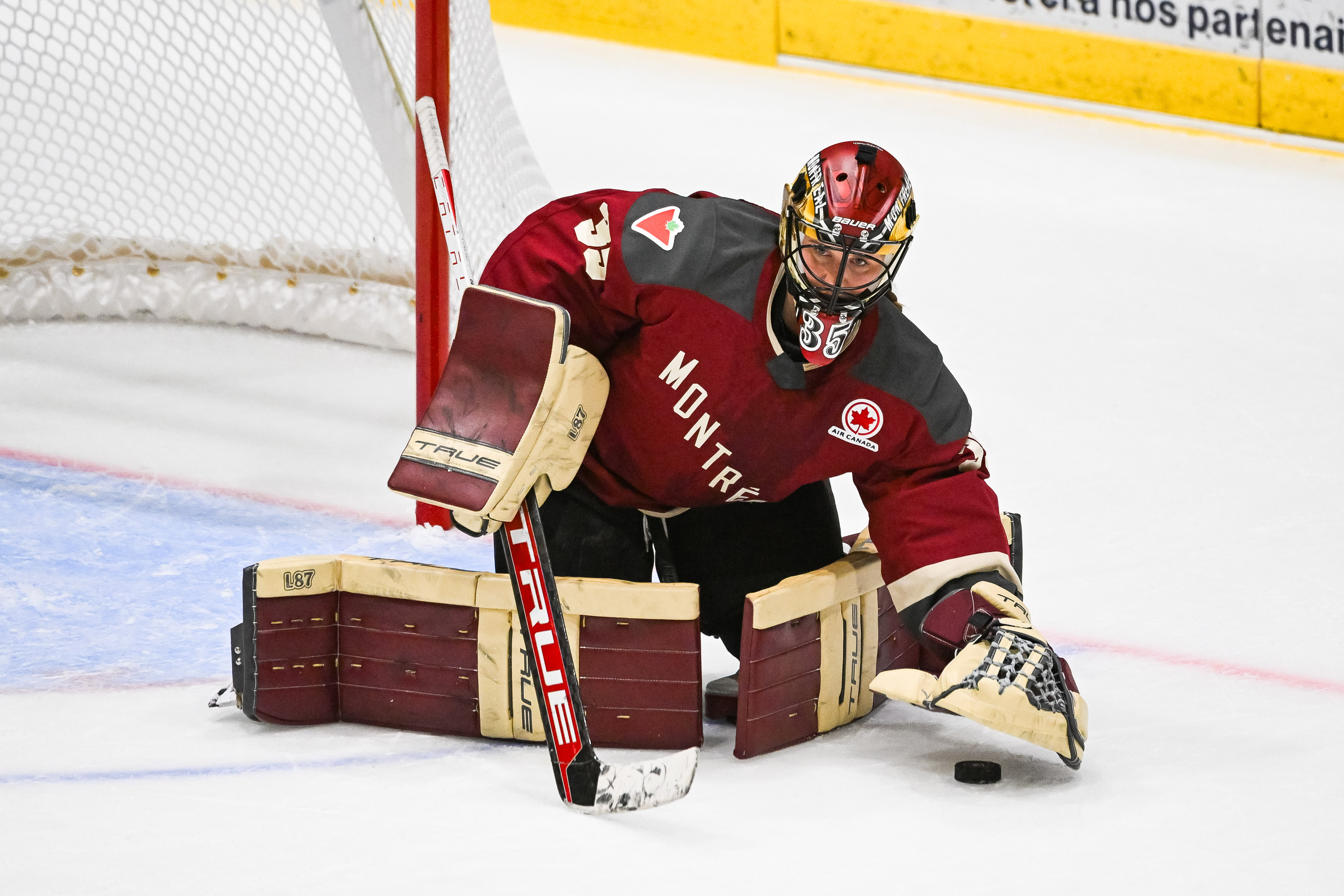
After playing its inaugural season without team nicknames, the PWHL unveiled names and logos for all six teams in the Professional Women’s Hockey League on Monday. The announcement comes ahead of the league’s second season, which is expected to begin in November.
With a short run-up to the start of their first season, the PWHL simply used representative cities in lieu of nicknames. So, for example, PWHL Minnesota won the Walter Cup last season.
With over a year to come up with the names, logos, and concepts, surely the PWHL must have nailed it, right?
Well, some of the names and logos came out great, and fit their cities to a tee. Others could definitely use some work. While we’re not here to judge, we are here to talk about it.
Related: Top NHL free agents in 2025 after Leon Draisaitl signs massive Oilers deal
Ranking 6 PWHL team names, logos
Here are our rankings of the six new PWHL names and logos.
6 – Ottawa Charge
Undoubtedly a cool concept, it feels like a lot was left on the table with the Ottawa Charge. Per their team page, “Inspired by the city’s motto ‘Advance – Ottawa – En Avant,'” Charge speaks to an electrifying force that pulses through Ottawa’s river and streets, through the stands of the arena and on the ice, driving us all only in one direction: forever forward.”
The logo looks like a hybrid between the Calgary Flames and Cleveland Cavaliers. Though the theory behind it works and the name is solid, a lot more could have gone into the logo design. At some point, there is such a thing as too simple.
5 – New York Sirens
The New York Sirens again have a great logo, but their concept is lacking compared to other PWHL franchises. So, while it isn’t necessarily bad, it’s just not good enough to top the list. The ‘NY’ in the back represents the structure of the NYC buildings, while the echoing ‘S’ on either side resembles the constant noise. Per their team page, “Inspired by the exhilarating blare of the goal siren, the New York Sirens are an ode to the hustle, rhythm and swagger of NYC.”
With the amount of history surrounding New York City, it is hard to see why the concept would surround a goal horn. Yes, it does resonate with the hustle and sound that comes with NYC, but there are certainly other routes that could have been taken.
And really is Sirens the best name they could have come up with?
4 – Toronto Sceptre
The Toronto Sceptre take a step up in the concept and logo of their franchise. Per Toronto’s team page, “The Sceptres embody Toronto’s regal history, commanding presence and rich heritage from Queens Quay to Queen Street.”
The ‘TS’ for Toronto Sceptre looks great here, with two colors that really pop. The Sceptre itself runs through the middle, creating a strong logo that resembles a strong history in Toronto. While nothing too crazy, this logo and name fits just right.
3 – Boston Fleet
The Boston Fleet team name and logo are very deserving of top-3 honors. Resembling the history of Boston and the nearby sea, they really nailed the logo. Showing a sail, anchor, and waves, all in the shape of a ‘B’ was executed to perfection.
As their team page describes, “The Boston Fleet pays homage to the unified spirit of our people, players, and fans, who move together with speed, strength, and a relentless might to add new legacy to Boston’s storied history of resilience.” Nicely done.
2 – Minnesota Frost
When talking about just a really clean logo and concept, look no further than the Minnesota Frost. What a great way to revamp the look of the inaugural Walter Cup champions. The frost that covers both the land and frozen lakes of Minnesota is a staple, and an excellent choice for their team name and logo.
Their team page nails it, writing, “When the first frost covers the land and lakes in crystal, the unique magic of Minnesota winter begins. Minnesota Frost celebrates hockey’s fierceness and beauty, a timeless Minnesota tradition, bridging generations.”
1 – Montreal Victoire
When taking into account history, concepts, and adding a sweet logo, the Montreal Victoire hit every note. Between the Fleur-de-lis, the wings of triumph, and the hidden ‘M’ in the center of the logo, their is nothing to complain about here.
As their team page says, “Win or lose, ‘Victoire’ is a mindset, a legacy and a way of life our decorated sporting city relentlessly pursues. The name Victoire will spur us on – to climb higher – for the glory of the team, the game and for all of Montréal!”
Easily the most complete concept in the PWHL, Montreal tops our list at No. 1.

