There’s a saying that a lot of athletes have used: “It’s the name on the front of the jersey that matters most, not the one on the back.”
Joe Paterno spoke those words, however when it comes to what that jersey actually looks like, it’s a completely different story.
Here are the five worst NFL uniforms that could possibly make your eyes bleed.
1. Cleveland Browns
Not only is the team terrible, but the uniforms are absolutely hideous. Not for any other specific reason than they are a solid color: orange. Who actually likes to wear orange? It washes you out, and reminds me of Snooki from Jersey Shore.
In addition to the terrible color choice, recently the team unveiled “new uniforms.” I’m sure Browns fans (if there are any) were anticipating something different, fresh and new. What the team’s supporters received was something terrible and disappointing—something they’re used to at this point.
2. Pittsburgh Steelers

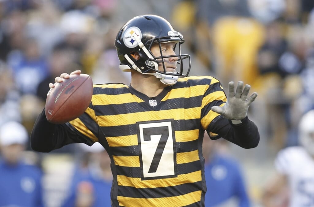
I can get down with the black and yellow (insert Wiz Khalifa song here). What I cannot be down with are the black and gold stripes the Pittsburgh Steelers wear when sporting their throwback jerseys.
The Steelers decided to go with the hideous uniforms of 1934.
They’re a combination of a Blind Melon music video mixed with an inmate topped with a honey bee.
Horizontal stripes on anyone, let alone Ben Roethlisberger should be a crime, which explains the prisoner-like look.
3. New York Jets
It’s as if all of the good colors were taken, and the Jets decided they would go green. Nobody is envious of these uniforms.
You should never match the grass, turf or green screens.
Naturally, someone will mention the Seattle Seahawks. Yes, they have the color green in the uniforms. However, those uniforms are worn by Super Bowl Champions, not the inventors of the “Butt Fumble.”
Big difference.
4. Oakland Raiders
Perhaps the Raiders should spend less time shopping for a new place to live, and start shopping for new uniforms.
Yes, silver and black on paper sounds nice, but when the only people that look great in those colors are the fans, something isn’t quite right.
It could very well be the silver and black simply reminds us of being let down season after season, still, the Raiders could spice things up a bit both on and off the roster.
Just a plain black uniform? This isn’t Pop Warner anymore guys, you don’t need to sell $1.50 candy bars to afford great looking uniforms.
5. Carolina Panthers
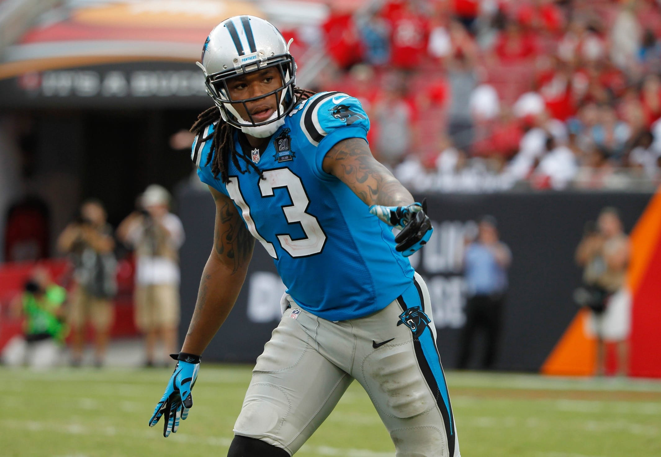
Teal is the most annoying color in the world. If you search the “teal,” about 14 shades of the awful color will be introduced to you. No, this is not the sequel to 50 Shades of Grey, either.
I even like the Minnesota Vikings’ purple and gold better than these uniforms.
And people, we need to talk about the panther. The logo looks as if he—I think it’s a he—is stuck in the 70’s and desperately wants to come back with the times. The least Carolina can do is change him up.
Plus, when the team is forced to sport the all-teal uniforms, it’s bad. Really bad.
Needless to say, when your mom’s favorite quarterback, Cam Newton, has to wear these colors, it doesn’t help anyone take him seriously.
