This is excellent. You have to love when social media teams for professional sports franchises take part in a little online jousting.
The Toronto Raptors unveiled a new logo on Friday that looked similar to another team around the NBA, the Brooklyn Nets.
https://twitter.com/bradhams/status/546014946778025984
Oh Drake, what have you done? Jay Z isn’t going to be too happy with you next time you open up for him.
Here’s the logo in full color.
Can confirm that is the new logo. Expect uniforms and a full colour scheme in the new year. http://t.co/G7H9pvZGl1
— (((Eric Koreen))) (@ekoreen) December 19, 2014
Anyway, the Nets didn’t seem too thrilled by this new design.
.@Raptors Looks familiar
— Brooklyn Nets (@BrooklynNets) December 19, 2014
Ouch. Wasn’t it enough that Brooklyn upset the Raptors in the playoff last year? It now has to go out there and throw shade publicly. At least give Canada this one thing.
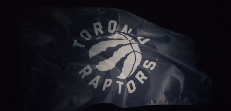
Here’s the hype video announcing the change in Toronto’s logo.
Photo: You Tube