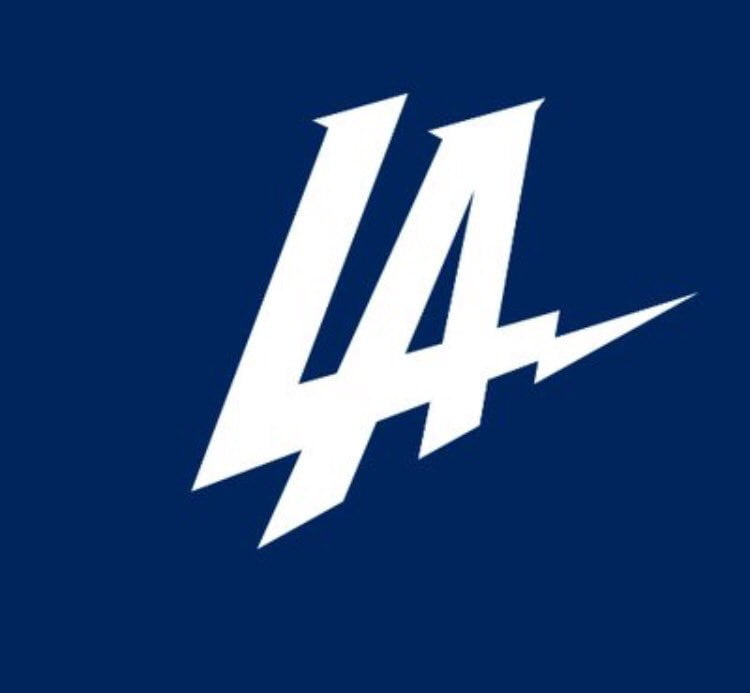
The San Diego … er … the Los Angeles Chargers have finally fixed their unsightly new logo. It’s quite a bit different now, too.
No. Actually, that’s a lie. It’s most certainly not much different at all. It’s just as awful as ever, but hey, the colors have been tweaked now!
New Chargers logo has been adjusted. Team displaying updated version with powder blue, yellow. pic.twitter.com/fUcRfF1JnS
— Michael Gehlken (@GehlkenNFL) January 13, 2017
It must have taken some seriously long hours to come up with that necessary change.
At least we won’t confuse the Chargers with the Los Angeles Dodgers now. But one wonders if this adjustment will have any impact on the potential lawsuit the franchise faces with LA Gear (more on that here).
Clearly, the move from San Diego to Los Angeles is going as smooth as possible. Or not.