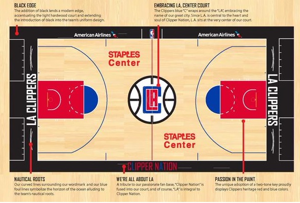
The Los Angeles Clippers could surely use a solid fashion team within the organization. A month after unveiling this ridiculously horrible new logo, the Clippers have doubled down with that odd-looking new style on the court at the Staples Center.
Beware, it looks like a combination of 1970s American Basketball Association style and some logos around today’s Arena Football League:
The Clippers unveil their new court. pic.twitter.com/VGgFHViO58
— Arash Markazi (@ArashMarkazi) July 18, 2015
Overall, it’s not too bad. Outside of the horrendous “LAC” logo, the black out-of-bounds area on the baseline and the two Staples Center logos in red, everything is legit.
In all seriousness, we aren’t too sure what the Clippers had envisioned here.
Then again, Steve Ballmer himself is one interesting dude. What goes through his mind in a given moment has to be one of the great questions around the NBA today.